This First Blog post is to explain what I aim to do on this Blog.
Which is to host my research on other website and the development of my web and social media work.
This First Blog post is to explain what I aim to do on this Blog.
Which is to host my research on other website and the development of my web and social media work.
When looking at my website over the course of the module, I feel that i done a great job, it been interesting learning the inner working of website from the element of the user experience, understanding the HDML and CSS coding as well as online presance.
website home page: When looking at the home page of my website it holds all section of my website. From the introduction of who I am as a designer. blog list about my work and recent updates. The gallery to showcase my work. With my contact info at the bottom.
Blog: My blog was to show user my recent development on my website so far. If i decide to use my website after university then I feel i would use it to talk about recent works or hirement.
Gallery: My gallery so far showcase my most recent work that I done on my year two graphic communication work. If I use my website after university I well showcase my client finish work to help boost my employment rating.
Contact: My contact is mostly my email and part of my address as I didn’t at the time feel ok to share all my information. However i would change that if I choice to use my website after finishing university.
Overall i feel the design of my website having not create one before is good. there are ares to improve but I well look at those at a later date when my knowledge on the subject has improved.
I decide to look at other website to see if there were any common trends, to see if I can make my website stand out more.
Argos: When looking at Argos website, the colour are mostly red for the logo and light grey, almost white. it has the most recent offers or events for sales, and how delivers work. the left side being for your personal account if your a common shopper, a Wishlist you can have to keep track of stuff that might go on sale and trolley for online shopping.

The tabs are also well done for having category’s of house hold objects, which help to aim in on a set item there looking for.

GAME: The game website stay with the color of black and purple, and a bit of grey to offset the tone of color. The slideshow like bar show the most recent offer or products as well as common items being sold at the moment.
The navigation bar at the top helps be looking in on a game system, coming soon games, other items and online shopping.

Blackburn college Moodle: The blackburn college website for student/staff is mostly great,white and blue. A ok colour tone but could draw people in more. The navigation bar is also not fully clear with Quicklinks going to area that are less used by most students. it also feel lifeless, making it more a website you go on when you have to and not for much else.

Overall: overall from reflecting on these website I look at. I feel that I should make my website look more colourful to help stand out while being pleasing on the eyes, have my navigation bar at top be either easy to understand or follow were people well need to look at most. while also having a bit of uniqueness to it.
A task that was something extra was to look at some articles that show what the future of technical might look at.


some of this are interesting like the sleep tech, and photographer Robot. The rest to me feel that more on travelling and increasing power levels in the world, which to me feels more of a case of damaging the earth and being less on protecting the planet.
After looking more, while this article is more on future technology in 2033 I feel it still useful.
https://99designs.co.uk/blog/design-history-movements/what-graphic-design-will-look-like-in-2033/


I feel these article while looking at technology in about 24 years time. They do show that typeface might be less useful or images are the only way to communicate with others. Which can be a problem as people well snuggle to talk to someone face to face.
This is my list of website that are my social media, as my way to showcase my work online for other designers and bosses that are looking to hire someone from the graphic design world.
Website: My link here is to my wbesite that is the focus of my work.
https://20222426.wixsite.com/liamhoolewebsite
Behance: Here is my link to my behance, which sadly I try to add to my Wix website but they don’t have a link icon, making it harder to add to my website. with having to use a text box for it.
https://www.behance.net/liamhoole


LinkedIn: Here is my linked link that I was able to post on my website. my LinkedIn it to be my connection to other designers or business that might be looking for hire me for a task.
https://www.linkedin.com/in/liam-hoole-965aa4196
It has show that while wix is a good website created, they are limited on website links you can show with icons.
When working on my pet website it was my way of understanding the Dreamweaver software. At first it was intimidating from trying to understand how the codes work as well as the way text highlight and what they mean.
HTML: Here my work on the HTML (meaning Hypertext Markup Language) it was mostly a case of going step by step with my tutor, who explain in detail why it dose that from having each page with different background, how click boxes can have colour that different when highlighting and adding text, After understanding it more it was a good software to use. It would be something if I practice more that i could see myself using if I go into making website for a career.


CSS: When creating the CSS it felt like understanding the skeleton of the website that user don’t normal see. It was a tricky process with having to make lots of / and * that make each line of text a code while not having any be errors or not work. It something that a lot of practice would be needed to do professional.

Overall I found learning about HTML and CSS thought Dreamweaver to be a interesting experience. While being something that is hard to understand in terms of coding, making them be easy to understand and work. I found it to be a interesting experience. I may practice more in my free time if i plan to go into website for my career or when I choose to have a website to showcase myself in a hight quality.
When it comes to hosting my website that I create thought wix it a case of trying to find a website that can do what i need my website to do. but not being tie down to a overprice and increasing interest contact.
Wix: With wix, while it is a site that free to make website of you choosing. When asking them to host your website, the money become the main way that run there business, from the cheapest having wix ads, which may put user of your site. To ones you pay them to do work you could create like logos and videos.

UKFAST: A website that looks at hosting that go great in deep of the hosting from Ram speeds, SSD, and Quad Core. which is something to help stand out from the other hosting sites. However i feel that if a user has no knowledge before hand, it can make them feel overwhelmed and less likely to use as there website host.

Fasthost: This host site looks more at domains for the html and giving support anytime for help on your site. One hidden thing is when looking at the free part for 1 year of a domain, while sounding nice of a deal, if you plan to use this site perminatly then it well increase the price of the website you host. Leading to high cost on maybe a no profiting website.

Bluehost: While at first seeming to be a welcoming site, it doesn’t show much of info and look to focus on customers reviews and how they feel. Were as they should be showcasing what they can give you over other website hosters.

Overall I feel that Wix is the best to host my website for the time being. I may look at other host website in the future after university. But the plan Wix offers a free way to host, and only if I plan to pay more for a better hosting that my future user and client want to view my work on then I may use a different host.
Here is my portfolio that is the same as my website page gallery. which is to show user of my website the recent work I undertake so far.


3) A5 Book cover: The quick task we did was to create a A5 notepad/book cover that we create to be personal to use. then taking either plain line paper or card paper for drawing. Which i did feel i was more free to be creative about.

4) Dystopia turn poster: The task was to take the word Dystopia, and then reflect the meaning in a good and bad way. I did this in the group of students I work with and did a poster on a nightclub. One side being a bad nightclub with dark colours and dirty wall and floors. And the good side being all glass, live music and royal colours.

5) Studio 123 unit logo: The task next was to create a logo that would fit what studio 123 is about. This I found tricky to do with my first idea was to do a rainbow for the theme of creative that the unit is about…but sadly most thought of the gay pride stuff. I did change it to the primal colours in printing and colour mixing. which did would better and got me to look more at semanims in my work.

6) Superhero comic cover: This individual task was to create a superhero that would reflect us. Be it from backstory, looks or outfit. Then create a form of media that we could use to showcase the outcome. I did a comic cover with my like for comics and have my super hero stand back to back with irl me.

By having a portfolio of my work, user can see that my design are like and if I can do the task they want me to undertake.
This screenshot are to showcase the first development of my website over on Wix.

First is my about me page, giving the user that see my sight the info on what my website is about.

Second is my Blog page on my website work and more on what I plan to do.

Third is my gallery showcase my most recent work on my website that user well be able to see my work and get a feeling about my form of work.

Fourth is my contact page and how user well be able to talk to me more and get info if they wish to hire me.
So far I feel I made good progress so far, while there is areas of improvement like the information on the contact section and how the gallery layout. However I feel I done good so far.
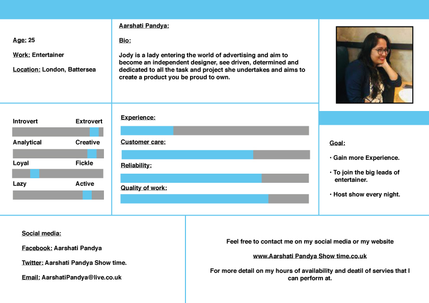
Here is the list of all my persona that I Created. The aim being to create people that would use my website and how give information on them.

2) Elizabeth Snow: an interior designer who may need help making a website to showcase her work.
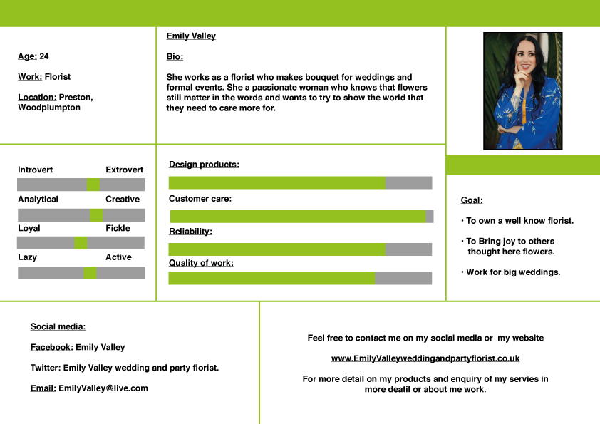
3) Emily Valley: A florist who caters for weddings and formal event that may want to advertise her business.

4) Racheal Ember: A worker at a heating company who want to help improve the business she works at with a website.

5) Sophia rose: A childminder who looking for work with the help of a designer business card.

6) Toby Hill: A lawyer who need help with finding clients online with the help of a good social media presents.

7) Arhan Khan: A plumber who hoping to boost his workload with online advertisments.

8) Aarush Iyer: a car salesmen looking to help support his family, but could use a designer to help boost his customers at his warehouse.
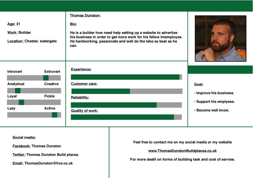
9) Thomas Dunston: A builder who want to increase his workload for his employees with better advertisements.
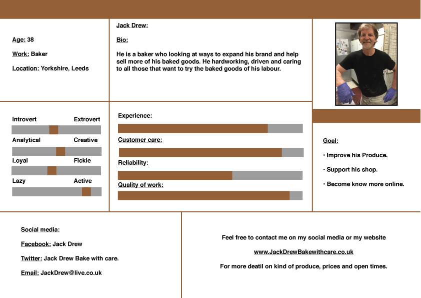
10) Jack Drew: A Baker who is looking at finding online way to support his shop.
This was a hard task to do from having to find picture that match the names I created, thinking of the jobs, places they live and online links. But overall it was a helpful task to support my website and what I need to do for it when thinking about who would use my website.
This is my word task on writing about the 5 ‘s on the element of the user experience. Which i did found to be tricky.
However I feel that if has help to give me a great deep on how to best develop my website. from who i need to aim it at, how to best draw user in and help start a foundation for my future work.
